Monday 18 April 2016
Sunday 17 April 2016

Saturday 16 April 2016

Friday 15 April 2016
Thursday 14 April 2016
Wednesday 13 April 2016
Tuesday 12 April 2016
Tuesday 1 March 2016
Digipack - Construction

By using the image adjustments menu I added a linear inner glow to a photograph I took in New York giving a border effect to the image. I also edited the image into black and white to reach my desired dark tonal mise-en-scene.

I added the track listing information using the same handwriting-style font as I used on the poster to make the campaign consistent and recognisable. I decided to place the track listing on the left of the page so that it does not interrupt the feature of the Chrysler building in the image which could also interfere with the text making it difficult to read. Another reason for this choice of placing is the inspiration I took from my existing product research by Amiee Mann. Finally I added a barcode and record company information to make my product appear more realistic and professional.

Creating the inside image for my digipack was fairly easy. I took a simple headshot of our model Aidan who features in the video and is the main artist in order to continue the recognition and help publicise him. I edited him into black and white using the adjustment tools and made sure the image was exactly centred. I decided to keep a consistent style throughout all four pages of my digipack which is the dark linear inner glow therefore after adding this I was finished as I didn't want to make every page look extremely busy.

I firstly made minor tweaks to a photograph I had taken in New York however I didn't want to over-edit it as I wanted to display the natural beauty and lighting. I simply added the inner glow one again to continue the house style of the digipack.

The final thing to do on my digipack was to add the template for where a CD disk would be inserted making it appear more professional and realistic.

Firstly I added the grid on my page due to the fact I want everything to be placed accurately and evenly. This front page is very linear and the squares had to be the same shape and exactly in place. I continued to use the muted black and white colours to sick with the tones used throughout the rest of my products yet I added a dirty yellow colour around the image to give a subtle pop of colour to make the imagery stand out. I ensured that the black border was the same size as the inner glow on the other three pages to make sure all of the digipack tied together.
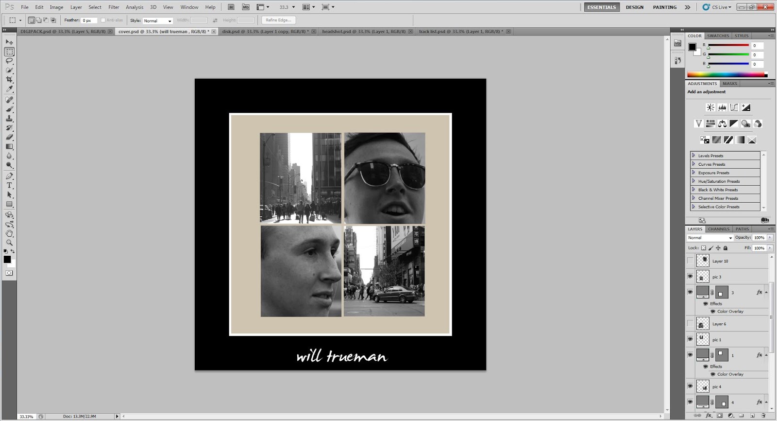
I added four images into the four squares; two candid shots of the artist and two shots taken in New York. I did this to summarise the leading song on the album 'America' which is the song we shot the video for and I think it provides to contrasting sides to the cover; human imagery and location photography. I also added the name of the artist onto the bottom of the page directly in the middle using the same font that I have used throughout.

Finally all that was left to do was add all four pages onto a foldable digipack template. This meant I had to add a spine which has the artist's name printed on it and I had to flip the two inside pages upside down so that the document could be folded correctly.
Tuesday 16 February 2016
Poster - Construction

Firstly I decided to create the dominant image of the poster which is the image-merging headshot. I took a side-view photograph of our model Aidan and cropped it using the magnetic lasso tool. I then placed this over the top of a skyline image I took in New York and after selecting the skyline layer I again traced around the head so that I had cut out the exact same shape image as the head on the NYC photograph. I then placed the photo of NYC over the top of the headshot and began to use the rubber tool to gently remove parts of the picture to reveal the headshot underneath. I continued to rub out the image until I was satisfied and then merged the layers together to produce one photograph of the man.

I played around with several different background colours including using more than one colour and splitting the page. I decided on a black background as the majority of the photograph has a light colour scheme therefore it stands out and is easily recognisable . I also adjusted the size of the photo various different times however decided that it looked the best when filling up most of the page and only leaving space for any additional text. I finally decided to place the image in the middle of the page as it is therefore straight to the point and with it being the only image on the page I wanted it to appear neat and uniform which i think is a style replicated from my existing product research as well as the linear style of my digipack cover.

My final task when producing my promotional poster was to include the informative text, this being the artist name, minimum album information and record label logos. I chose a modern handwriting style font printed in white to standout on the black background and I think the natural style font is relatable with the audience. I didn't want to clutter the page with text therefore only included what I thought was necessary and I have placed it evenly spaced out in a clear font size.
Wednesday 10 February 2016
Tuesday 2 February 2016
Filming Day 11
These are the new shots we've filmed in response to our target audience questionnaire feedback. They are to emphasise the fact that he is studying in Newcastle which will make the narrative slightly clearer. We also re-filmed some lip singing that we weren't satisfied with.
Monday 25 January 2016
Draft 2 Questionnaire Feedback
We gave our Draft 2 Questionnaire to 30 A Level Students and a couple of students who are currently studying media at university. The dominant feedback we received is that the narrative is not clear enough. After watching our video many people asked us to clarify what the story was about and after we briefly explained they found the story did make sense. The answers to the 'is there anything you would change' question were all very similar. The feedback was to basically add some more footage to emphasise the face that the man is studying in Newcastle and that he misses home. To do this we plan to shoot another filming day at Newcastle University and feature signage and other obvious indicators that he is studying here.
Friday 22 January 2016
Tuesday 19 January 2016
Draft 2 Music Video - America
This is the second draft of our music video. We have applied changes that arose from the two interviews we conducted with two members of our target audience. These mainly included a couple of shot changes and timing issues.
Monday 11 January 2016
Subscribe to:
Posts (Atom)