
By using the image adjustments menu I added a linear inner glow to a photograph I took in New York giving a border effect to the image. I also edited the image into black and white to reach my desired dark tonal mise-en-scene.

I added the track listing information using the same handwriting-style font as I used on the poster to make the campaign consistent and recognisable. I decided to place the track listing on the left of the page so that it does not interrupt the feature of the Chrysler building in the image which could also interfere with the text making it difficult to read. Another reason for this choice of placing is the inspiration I took from my existing product research by Amiee Mann. Finally I added a barcode and record company information to make my product appear more realistic and professional.

Creating the inside image for my digipack was fairly easy. I took a simple headshot of our model Aidan who features in the video and is the main artist in order to continue the recognition and help publicise him. I edited him into black and white using the adjustment tools and made sure the image was exactly centred. I decided to keep a consistent style throughout all four pages of my digipack which is the dark linear inner glow therefore after adding this I was finished as I didn't want to make every page look extremely busy.

I firstly made minor tweaks to a photograph I had taken in New York however I didn't want to over-edit it as I wanted to display the natural beauty and lighting. I simply added the inner glow one again to continue the house style of the digipack.

The final thing to do on my digipack was to add the template for where a CD disk would be inserted making it appear more professional and realistic.

Firstly I added the grid on my page due to the fact I want everything to be placed accurately and evenly. This front page is very linear and the squares had to be the same shape and exactly in place. I continued to use the muted black and white colours to sick with the tones used throughout the rest of my products yet I added a dirty yellow colour around the image to give a subtle pop of colour to make the imagery stand out. I ensured that the black border was the same size as the inner glow on the other three pages to make sure all of the digipack tied together.
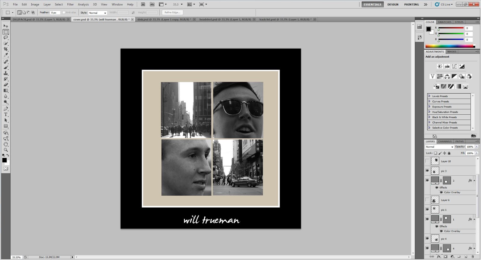
I added four images into the four squares; two candid shots of the artist and two shots taken in New York. I did this to summarise the leading song on the album 'America' which is the song we shot the video for and I think it provides to contrasting sides to the cover; human imagery and location photography. I also added the name of the artist onto the bottom of the page directly in the middle using the same font that I have used throughout.

Finally all that was left to do was add all four pages onto a foldable digipack template. This meant I had to add a spine which has the artist's name printed on it and I had to flip the two inside pages upside down so that the document could be folded correctly.