Saturday, 24 January 2015

Target Audience Questionnaire - Question 7 - Response

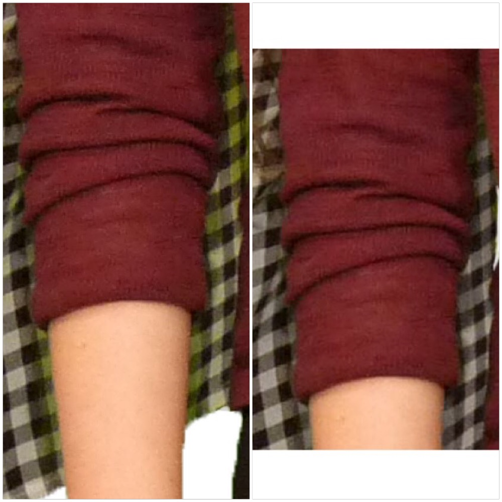
To lighten the overall image of my front cover, in response to my audience research, I edited slightly with the exposure tool and changed the background colour.

Original - No exposure change
New - Exposure increased
Original - Exposure changed and original background colour
New - Exposure changed and a lighter background colour


Target Audience Questionnaire - Question 7 - Results


Question 9

Are the images I have used clear enough?


Yes - 100%
No - 0%

All participants said that my chosen images are very clear, this is what I aimed for and I'm pleased that people have noticed the high quality.

Question 8

Is there too much grey throughout my magazine?


Yes - 0%
No - 100%

All participants agreed that there was not too much grey in my magazine and I think this is because the majority of them noticed that it was my house style. I know this because comments included:
  • 'It's good there is a clear colour scheme.'
  • 'It contributes to the house style'
  • 'There is a lot of grey but it sets a house style.'
  • 'It sticks with the house brand'

Question 7

Do you think that the front cover is too dark?


Yes - 4/6
No - 2/6

There was a clear response to this question which was that the front cover is too dark. Because of this, I decided to alter the brightness of my magazine cover slightly. Evidence of this can be found in the following blog posts.

Question 6

Is the article long enough or would you prefer it longer rather than the image so big on the other page?


It's long enough - 50%
It's not long enough - 50%

There was an even split between whether to make my article longer or not. I have decided not too as there was no clear feedback that it was not long enough and I would prefer to stick to the simplistic house style.

Question 5

What do you think of my chosen photos of the band 'The Franks?'


Positive - 100%
Negative - 0%

All comments regarding the quality of my photographs were positive, good placing and lighting were often commented on which is very pleasing.

Question 4

Do you think the two page spread is too plain?

Yes - 0%
No - 100%

All participants agreed that my two page spread was not too plain. Some comments included the following:
  • 'It continues to show the simplistic house style, more would look too much.'
  • 'I think it looks good and is simple yet effective and matches well with the other pages.'
  • 'It contains all information and has a main image which contains colour.'

Question 3

Do you think there is a clear house style throughout my magazine?

Yes - 100%
No- 0%

Every single person who reviewed my magazine and completed a questionnaire thought that my magazine had a house style; this is great feedback and proves that I have kept a consistent theme.

Question 2

What gender are you?

Female - 4/6
Male - 2/6

I decided due to my first audience questionnaire that my magazine would not be gender specific. Therefore, the gender ratio results do not impact the conclusion I will create from this research.

Question 1

How old are you?

18 years old - 3/6
17 years old - 2/6
16 years old - 1/6

50% of people taking my questionnaire were 18 years old; the rest were either 16 or 17. My target audience is ages 18-35 so these questionnaire results should be fairly representative.

Target Audience Questionnaire

  • How old are you?
  • What gender are you?
  • Do you think there is a clear house style throughout my magazine?
  • Do you think that the two page spread is too plain?
  • What do you think of my chosen photos of the band 'The Franks.'
  • Is the article long enough or would you prefer it longer rather than the image so big on the other page?
  • Do you think that the front cover is too dark?
  • Is there too much grey throughout my magazine?
  • Are the images I have used clear enough?

Thursday, 22 January 2015

Flat Plans - Revised

When producing my final pieces, I discovered that my original flat plans were difficult to recreate due to sizing and placing issues. I found that it was easier to follow my plans briefly but alter them throughout the proceedings in order to achieve the best designs possible. Because of this, I have produced new flat plans that match my completed designs.

Monday, 12 January 2015

Style Models

When creating vague ideas for the appearance of my cover, contents page and double page spread, I researched a few style models to take inspiration from. My finished designs will display similarities taken from these following magazine features which I have adapted to fit my own house styles and flat plans.


Sunday, 11 January 2015

Creating My Article - Image


The image on the left is the image I decided to use in my final article and there are a number of reasons why I used that one instead of my other option which is the image on the right.

- In the image on the right I don't like how the people's feet are not in line. They're standing different measurements away from the camera causing the shoes to be in a diagonal line rather than a straight line as they're standing alongside each other. I think that this makes the photo appear less professional.
- I think the expressions in the photo that I used are more intriguing and exciting than in the image on the left. The images used in my cover and contents page have similar, natural smile, facial expressions therefore I wanted this image in my article to be slightly different and not replicate the others.
- The image I chose not to use is similar to the one used in my contents page and I did not want to use similar images when I had so many other different image options to choose from.
- I think the image on the left which I used engages the audience much more. Due to the fact the image is featuring on my article, I wanted the audience to feel a certain connection with the band as they're reading and I think this more close up image which those expressions does this more than the simpler, more common image on the right.

Creating My Article

 
When creating my article on InDesign I think the most important aspect of the programme that helped me produce a professional looking article was the lines to indicate equal spacing and proportion.
  

As shown in this image the entire page was sectioned off with lines for columns, the image and title/opening text spacing. This really helped me achieve a clear page that was not too busy, overlapping or close together; every aspect of the page has a section which is perfectly in line due to the use of rulers on the top and side of the page. Proportion and clarity are important aspects for me as due to the 18-35 age target audience, people who are a bit more mature will appreciate pages that are easy to read, understand and attractive. This is opposed to a page which is too busy with no structure and poor presentation.


The two images above are with an without the structure lines/boxes. Because the left side of my article features the title, small introduction, paragraph separating image and quote, all before the main article content begins, I wanted these to be nicely proportioned and not too cluttered. The rulers, column spacing lines and text boxes allowed me to ensure each part of the page was, in this case, perfectly centralised and had equal spaces between them. This makes my article appear much more professional than if I had simply placed the sections of text anywhere and not measured widths or spaces.

Saturday, 10 January 2015

Creating My Contents Page - Image


The picture with the grey background is my final chosen image to feature on my contents page and there are a number of reasons why I decided on this one and not two other similar images I took which are placed underneath.
- In the image I chosen all three people are looking at the camera whereas in the other two the centre person isn't looking directly at the camera.
- I didn't choose the bottom image as I think that the people appear awkwardly placed. There is too much room between the people which I think makes it look like an unnatural stance which would make my page appear less professional.
- Another reason I didn't use the bottom image is because the girls appear too smiley. Although I do want them to appear happy, I think that the smiles in this image are too exaggerated for the natural look I'm aiming for.
- In contrast in the middle image I think the people, especially Kay on the left, doesn't look happy enough, the expression is muted and portrays a negative vibe.

Friday, 9 January 2015

Creating My Contents Page

I decided to include live images in my contents page in order to illustrate the contents sections regarding live gigs and festivals. They also add a bit more colour into the page and prevent the right hand side contents from appearing to have too many words which may prevent people from engaging and reading it. I took these images myself and used them because I think that they complement each other due to not being too similar and having completely different settings and colours. In the first image the artist can be clearly seen and the composition is clearly and action shot split into half's; the first half on the left focuses on the artists branding and stage set up and the right hand side is purely in focus on the artist in action. The second image is much different. This displays an entire setting which extends much further than just on stage; you can clearly see the festival branding, stage screens, surrounding sky/greenery and most importantly the audience engrossed in the show. Because of what both of these images include I think they work well together to illustrate different aspects of live music; close up expression and overall festival atmosphere. My target audience is 18-35 which is peak age for watching live music; it's what young adults enjoy spending time and money on so it would only be right to include this factor somewhere in my music magazine.

Creating My Contents Page


I wanted the actual content information section of my contents page to appear in a clean cut section so the audience can find it easy to read and simple to understand rather than the page being too busy and confusing. The style of my magazine is simplistic in the sense that it's easy for the audience to understand therefore I wanted the contents list to be all inline and this is emphasised by the white boxes being all the same shape and helping to create a line on the left. I sized the 'subscribe today' advert in the same way so that it was the same length as the white lines surrounding the subheadings so the entire left hand side section was clear cut.


Thursday, 8 January 2015

Cover image

Original Image


Final Edited Image


Practical - Photo editing


By using the following adjustment options, I was able to edit my front cover photo to have the desired effect.


  • Brightness and Contrast can allow a photo to change from appearing to be taken in the day, to appear to be taken at night. It can either brighten or darken the overall tones on the image and by using the contrast scale, the sharpness of the photo can be manipulated to appear either  more crisp or blurred.


  • Shadows and highlights allow you to change the visual dimensions of the face and provide the opportunity to make an image appear more three dimensional due to creating shape. This is done by playing with shadow levels and highlighting where appropriate, to manipulate the surrounding lighting.


  • Exposure allows you to either increase or decrease the highlights of an image however maintaing the dark shadows. Offset and gamma are slightly different, offset adjusts the midtones and gamma adjusts the dark tones.


  • Hue changes the colour of the image by altering all tones to one specific colour with light and dark. Saturation, when decreased, can remove all colour from the image making it appear in black and white. When increased, can exaggerate all colours making them appear almost aluminous. Lightness can remove either all of the light tones, or all of the dark tones out of the image.


Practical - Colour Editing

Due to taking my photos on a green backdrop, there was a lot of green reflection and shadow on my photos when I came to use them. This is because of a variation of lighting and positioning settings. In order to fix this issue, I used the 'Eyedropper Tool' and then followed by the 'Colour Replacement' tool.


Before and after:

Wednesday, 7 January 2015

Potential Photos

I did a photo shoot in order to capture the best possible images to use in my magazine. I intended to get a photo to use as the dominant image on my front cover, a small image to feature in my contents page and a clear image to fill an entire page of my two page spread. I resulted in having too many to choose from and the process of elimination was very difficult! The images in this presentation are the possibilities I had to choose from and take on to further editing.